Another Responsive Data Tables Approach
Chris Coyier posted a nice, working solution to a real problem over at CSS-Tricks. Basically, CSS lets you style your website to look and work well on mobile devices by over-writing the styles of your full-size website. There are performance drawbacks to this approach, but for the most part it’s the best-of-all-possible-worlds solution.
One thorny problem, though, is over-riding the style of certain elements that use the width of the screen liberally by default. One such element is the venerable data table.
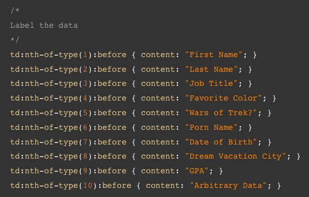
Coyier’s solution is great in that each table cell is labeled. However, doing this requires either writing CSS manually for every data table on the site (which is near-impossible for large sites) or having the same thing done with scripting on either the server or client side:
I propose a generalized solution that requires no scripting whatsoever. The drawback of this method, though, is that the cells are not individually labeled. The example is also more compact, but this aspect can be tweaked by marrying the two methods:
@media screen and (max-width: 720px) {
  table {
    display: block;
  }

  td,
  thead th {
    border-color: #444;
    border-style: solid;
    border-width: 0 2px 0 0;
    display: inline;
    float: left;
  }

  td:last-child,
  th:last-child {
    border-right: 0 none;
  }

  thead th {
    background: transparent;
    font-size: 1.1em;
  }

  tr {
    display: block;
    float: left;
    clear: left;
    padding: 6px 0;
    width: 100%;
  }

  thead tr {
    border-bottom: 4px solid #444;
    margin: 0 0 .3em 0;
    padding: 0 0 .2em 0;
  }

  tbody tr:nth-child(even) {
    background: #ddd;
  }

  td:nth-child(5n+1),
  th:nth-child(5n+1) {
    background: #FFD8D8;
  }

  td:nth-child(5n+2),
  th:nth-child(5n+2) {
    background: #FFE8D8;
  }

  td:nth-child(5n+3),
  th:nth-child(5n+3) {
    background: #FFF8D8;
  }

  td:nth-child(5n+4),
  th:nth-child(5n+4) {
    background: #D8FFD8;
  }

  td:nth-child(5n+5),
  th:nth-child(5n+5) {
    background: #D8D8FF;
  }
}
Open the working demo and resize your window to under 720 pixels wide to see the effect. I call this approach the “Rainbow Tables” method :-)
Thanks to Chris Coyier for posting a thoughtful working solution, and thereby motivating me to post about my approach after sitting on it (in production no less!) for almost a year.
