iPhone alarm clock improvements
You’re like me: you use your iPhone as an alarm clock. You even cued up Sonny & Cher’s “I Got You Babe” to play just like in Groundhog Day (to remind yourself every morning that the only way to beat the futility of day-to-day life is to strive for what you really want).
Yeah, you’re like me. So I’m going to assume these things are true too:
- When you wake up, the lights are off and your eyes have been closed for 4-12 hours
- You’ve kind of enjoyed being asleep, and are kinda cranky at whatever’s making that racket
- When I say cranky, I mean your judgment may be a little impaired too
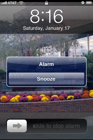
What am I getting at here? The iPhone alarm clock is really usable — it’s easy to set, fairly customizable, can schedule alarms really well, and is reliable as it gets. The only time that the usability sucks is when you’re just waking up. Here’s what it looks like when the alarm goes off:
Here are the problems with this in my opinion:
- It uses your default wallpaper, which could be blindingly bright with undilated pupils and other changes to the eye that occur in low-light conditions
- The text is small, condensed, and white, making it hard to read because optical resolution is lower at low-light conditions, and the brightness of the letters makes halos around each one
- The snooze button is small, and fumbling around for it can be very frustrating
- On an older-fashioned alarm clock, you don’t actually read the word ‘Snooze’ when you hit the button — it’s just the big button on top. Reading the word makes you mentally connect-the-dots. Call me weird, but sometimes when I wake up and read the word Snooze on the phone I think I’m in some Dr. Seuss-esque dream
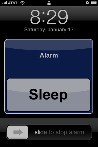
So I propose an interface more like this:
An Apple designer could make it prettier, but the basic ideas are there. The background is black, all elements are — at brightest — 74% gray, the Snooze button is about twice as large, and it says Sleep instead of Snooze. Also, it doesn’t really break from the core iPhone UI; the same slider bar, clock, top bar, and dialog colors are all present (though I used black text in the button for contrast’s sake).
If you’d like to know more about human vision in low-light conditions, check out these Wikipedia articles for starters:
Also, for some User Interface advice, knowing about Fitts’ law could be really handy.
It would also be great if there were an easy indicator to know when it’s in Snooze mode. I often set a second alarm because I’m not sure, so then there are two alarms going concurrently. Then, as I finish checking my email and Facebook, a little dialog shows up and I hear that damned song again. How about putting the number of Snooze minutes left inside of the alarm indicator in the top bar? Thanks.

