Moodboard
Identity and mood
Brand positioning
Promise: We make the least-breakable widgets on the market in the Peoria area.
Mission: Take the Chicagoland area's widget market by storm in the next five years.
Tone: Direct, concise, uncomplicated. You should get what we're saying the first time you read it.
Elevator pitch: "You know when you're up on the top floor trying to install a widget, and it breaks? Yeah, we've dealt with that forever, too. Our company makes widgets that don't break, so you pay less and get more."
Logo mark concepts
Worked through 8 concepts, which seems like the right number to really explore the creative space. Each concept is a black-and-white rendering, since the end result has to be used for web, print (including b&w), and other media.
-

Rushed the logo -

Rushed the logo -

Rushed the logo -

Rushed the logo -

Rushed the logo -

Rushed the logo -

Rushed the logo -

Rushed the logo
A logo mark should accomplish a few things:
- Be quickly recognizable
- Hint at what the brand is for
- Not look cheesy, trendy, trashy, or otherwise negative
- Be able to be printed in black-and-white as well as full-color
- Allow placement in prominent ways like signage
- Allow placement in tiny places like tab icons
- Ideally be a bit clever
Color
Color plays a big part in bringing a brand together. Here is the palette of the base scheme, right next to each other. If you can't feel a brand impression or at least get a hint at a mood, it might be worthwhile to revisit the scheme.
- #0081a7
- #f07167
- #00afb9
- #6100a7
Often the brand palette is used more subtly, via the light versions of the brand shades. These washed-out or pastel tones should also work together to give you a hint of the brand:
- #ccf4ff
- #ffcfcc
- #ccfcff
Brand package
Every site/brand has one or more assets that get dropped all over the place: logo for print, social, app icons, etc. Social usually has cover images. There are defaults and treatments that are best explained.
Icons and tiles
| Image | Description |
|---|---|
 | The chosen logo concept with its main color treatment |
| | The app icon when you install this site as a bookmark on a mobile device. |
| | The simplified mark used as an icon in browser tabs and bookmarks. |
 | An app tile, primarily for Windows. |
 | A wide app tile, primarily for Windows. |
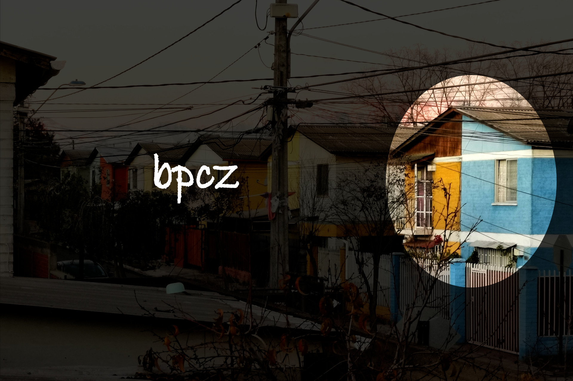
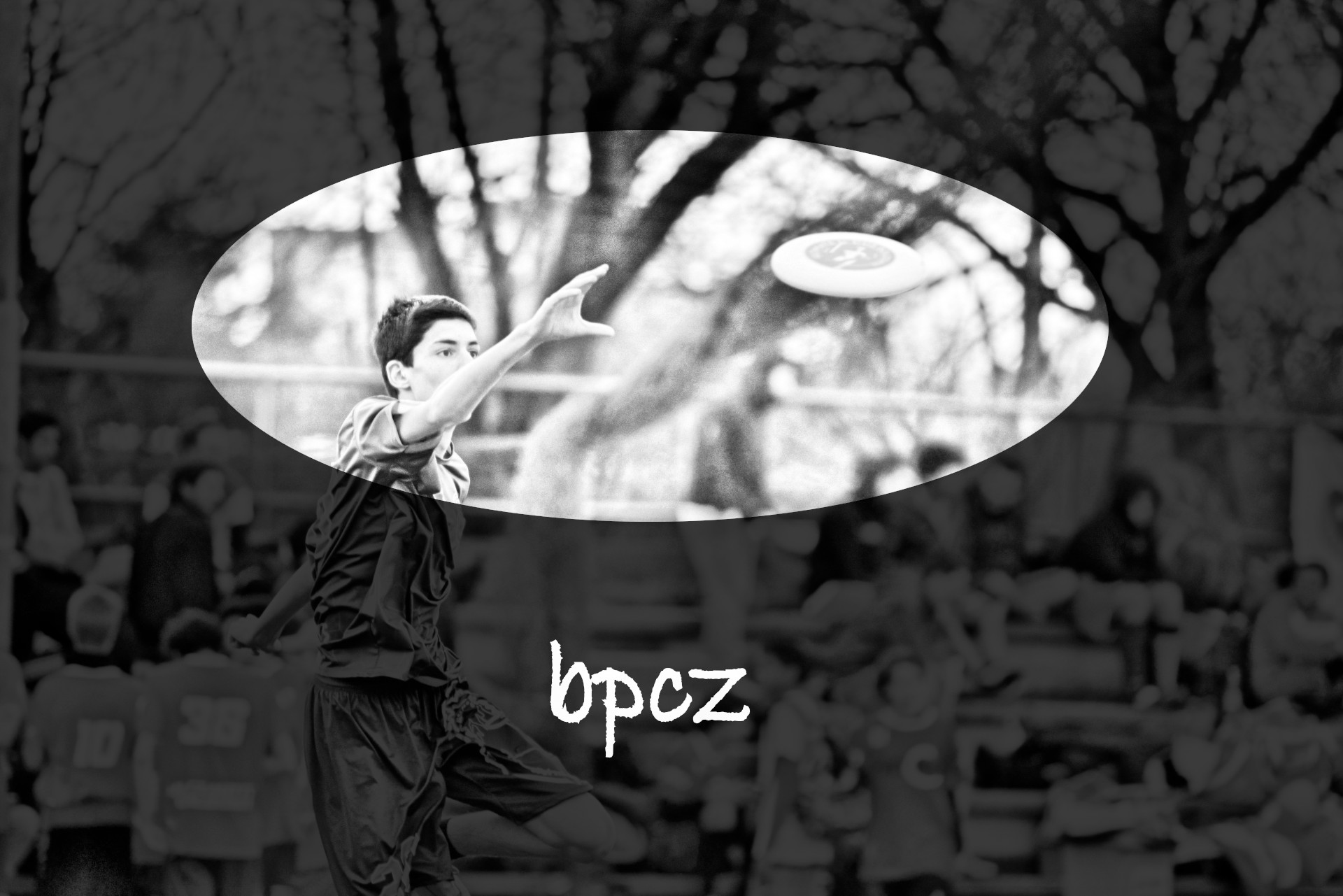
Social

Mood
In this section we'll leverage the defaults in the system to see how the design choices reinforce a brand mood.
Card
A card is usually a good example of a site's mood, since it often has the site's choices of shadows (lighting direction), borders, corners, colors, image treatments, etc.
-
Moodboard
Fonts, colors, logos and imagery, and other things that contribute to the feel.

Defaults
Here are the individual properties, highlighted for review:
Along with the standard typographic styles demonstrated in the section below, this paragraph has the default border on it. It also has some padding applied, since otherwise the border would be tight to the text.
border--default: 1px solid
This paragraph is similar to the one above, but it applies the standard amount of corner rounding for the site. In broad terms, very square corners feel calculated, structural, rigid, whereas a very round corner feels smooth, safe, playful. A subtle rounding in between can evoke a compromise between two extremes.
border-radius--default: .25em
Here we add the default box-shadow. Even if a site doesn't explicitly use shadows (ie. flat design), setting a default has value because it gives a design idea of a light source and its direction. This can be used for art direction, and can contribute to imagery choice; keeping consistent lighting direction can make a site feel cohesive.
box-shadow--default: 0 .1em .75em rgba(99,99,99,.625)
This box demonstrates how wide a box will go within the content area. Within reason, a narrow content area feels legible and cozy, while a wide area feels creative and expansive. We typically set up a 1200-pixel-wide content area, for two good reasons:
- A 13-inch laptop usually has the equivalent of a 1280-pixel width, so 1200 gives some breathing room in regular conditions
- The standard image specification for the site, based on Facebook's social share image spec, is 1200x630. At a 1200-pixel content area width, we can format all our images consistently and they'll take up their allotment
The standard spacing on the site is multiples of a single,set value. This way, if you end up wanting to change the feel of the site, you can do it by changing one thing in one place. A site with big whitespace feels luxurious and upmarket, while tight spacing feels efficient but can also come across as unrefined. Here is a single space, not very indicative of much on its own:
We set the spacing based relatively on the root font-size, which is almost always 16px.
spacing--single: 0.625rem
Motion, transitions, animations, and 'micro-animations' (which is industry buzzword talk rather than a meaningful distinction) can also influence how a visitor feels about your brand presence. An example of the default transition timing is below:
Human perception and preference for snappy interfaces constrains transitions to between instant and half a second. Obviously you can't make a transition faster than instant, and any slower than half a second and people feel like there's a computer problem.
transition--default: all .3s ease-in
Typography
Below are textual explanations of the typographic choices, as well as some samples of common elements. This is what normal body text looks like, for instance.
Heading 2 begins a section
Following a heading should be some text. If there's a heading and then another heading it's usually a sign that the content isn't being outlined in a manner that humans of all abilities as well as search engines can easily understand.
Level-3 headings are most common within text passages
A level-1 heading is often the page title. Depending on your school of thought, the logo may also be a level-1 heading. Level-2 headings are for section headers. So once you've gotten into a section and are writing text, you're using third-level headings to keep the right outline level.
There should be a comfortable amount of space between paragraphs. Not a tiny space that makes it feel like a continuous paragraph, nor a giant space that makes the page feel like a void.
Anyway, level three headings, as a common text treatment within body text, should appear distinct from the paragrpah text, but should be legible and easy to visually discern when skimming or scanning.
Level 4 is the last practical heading level
In practice, a document written for humans on the web doesn't go down six outline levels. If you find yourself writing a fifth-level heading, it may be time to reconsider the density and complexity of the page. It might be worthwhile to write simpler prose and split different concepts onto different pages.
Alas, Level 5 exists
More often than not, the type scale approaches the body text size around heading level 5 or 6. It's not uncommon for heading level six to be smaller than body text, albeit bold or italic or underlined or a different font or a different shade/color. If you're writing a dense, technical site, it's probably worthwhile to keep heading 5 bigger than body text.
Might as well be creative with heading level 6
An important thing to note with heading levels, beyond font size and text treatments, it the comfort of the spacing between a heading and text, especially above it. A consistent amount of space between all text elements including headings is similar to square corners: harsh, calculating, flat. A variable amount of space (bigger headings have bigger spaces) feels more human and organic.
Typefaces
Here are the fonts used to evoke brand feelings and aid the user in reading the site.
This paragraph probably looks like the once above it. That's because paragraphs are overwhelmingly set in the primary font. The web is a majority of sans-serif faces for the body copy, but a serif can give a classic, timeless feel.
font-family--primary: 'Public Sans', Arial, Helvetica, sans-serif
Here is some body text set in the secondary font. Depending on the face being used, this may not be particularly easy-to-read. The secondary font is for making a statement in your headings and other places where feeling can be generated with text treatment. See in the definition box that the main font is declared, but then there's a 'stack' of web-safe fonts separated by commas. These are the fallbacks for when the web font doesn't load. You can also use them as secondary brand fonts.
font-family--secondary: 'Emberly', Georgia, Times New Roman, serif
Secondary font in realistic example
If your site has code samples, having a monospace font can be a good, subtle branding enhancement. Typically we'll just set a web-safe stack, but if you have a technical site you'll likely see a benefit picking and loading a brand-specific code font.
font-family--monospace: 'courier new', courier, monospace
  // Here is some code as an example, set in monospace font:
  console.log({
    fontName: 'test1',
    sillyCode: 'what the heck?'
  });
Text boxes and other form inputs can have their own font, and on this site it is set to this! For the most part you're gonna want to stick to a boring sans-serif font for form inputs, since that's what users expect.
font-family--input: 'Public Sans', Arial, Helvetica, sans-serif
Treatments
This paragraph has the standard line-height (leading) applied. A value of 1 means the text is strictly single-spaced. A value of 2 is double-spaced. In practical terms text feels legible when it's a little less than 1.5. You can make the text feel urgent and dense by going lower, or breezy by going higher.
line-height--default: 1.425
This is probably more difficult to read. Body text can be nearly double-spaced and it still feels pretty comfortable. Headings with more than about 1.2 spacing begin to subvert the proportions of space. In order to preserve the gestalt of the heading's logical text grouping, text with a line-height for headings should be nearly single-spaced.
line-height--heading: 1
Text shadows are not typically applied to body text because it is so small, and the shadows can interfere with the shapes of letters and words when reading. But headings, especially those placed over image backgrounds, can benefit from a little shadow or glow, especially when a brand mood appreciates depth and lighting over flatness.
text-shadow--default: 0 0 2px rgba(0,0,0,.325)
Elements
A blockquote is a way to highlight a large amount of quoted text. Often you'll find typographic flourishes in conjunction with lines, spacing, and especially big quotation marks. Colors and backgrounds are also not uncommon.
Next, after this paragraph, is a horizontal rule. They can be as plain and utilitarian as a 1-pixel black line, or an ornate source of visual flourishes.
Unordered lists most usually have bullet dots at the beginning of each line.
- They should be brief tastes of information
- They should be easy to skim and scan
- Both hanging and flush indentation are acceptable
- Lists work best with between 2 and 7 items
- Styling the bullets themselves has historically been more trouble than it's worth
- Numbered lists are like bullet lists, but with numbers
- Bullets are for equal-strength points, while numbers imply order
Here, near the bottom of all this discussion of brand and mood, are links, of all things! Within body copy you'll find links, as well as bold, strong text and italic, emphasized text. Please, dear reader, keep underlines on textual links, and avoid using underlines for non-link purposes.

